PowerPoint
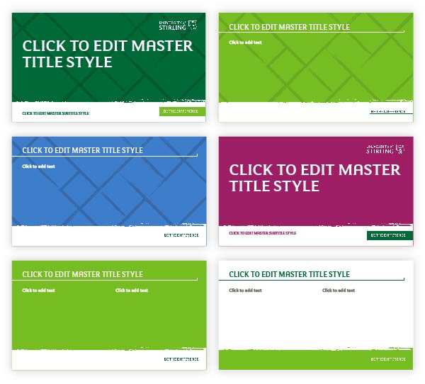
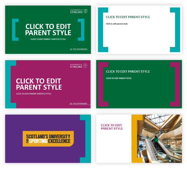
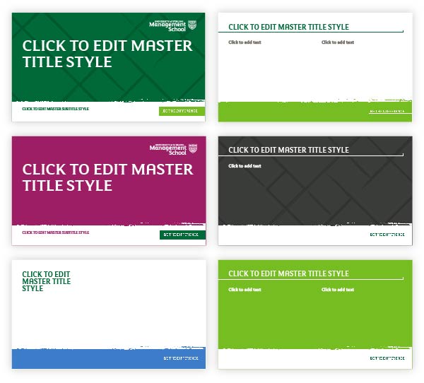
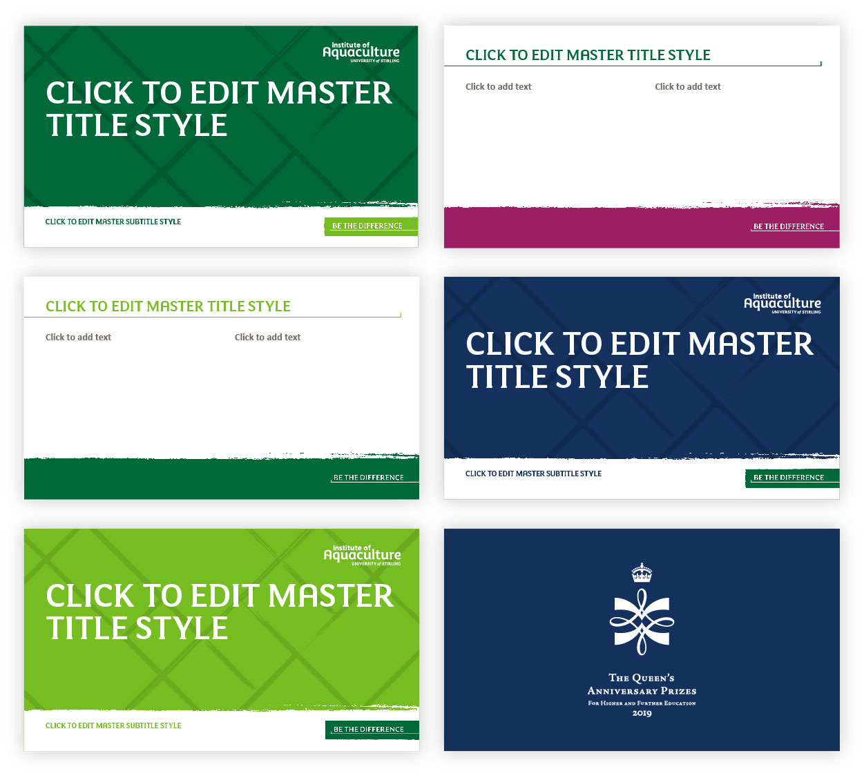
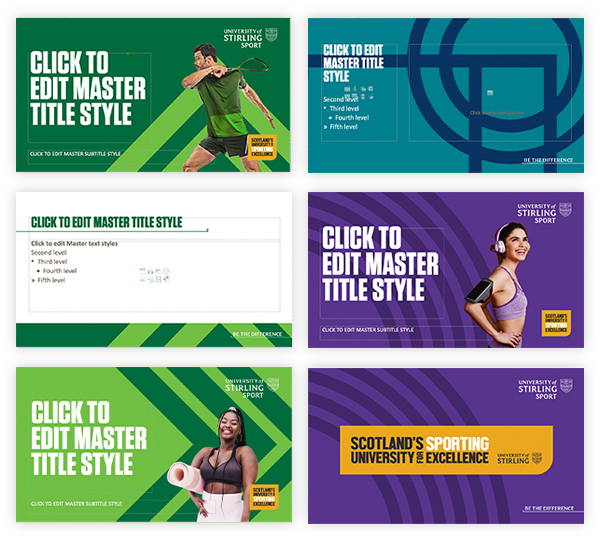
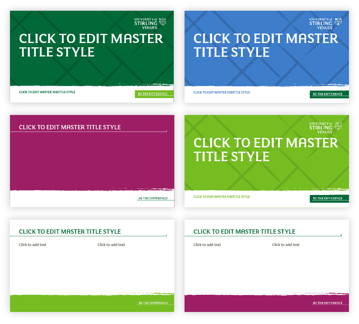
PowerPoint templates have been carefully designed to bring our brand identity to life. The templates allow you to tailor your communications in a visually engaging way, whilst reinforcing the University of Stirling brand.
Third-party fonts - such as FS Maja - are not embedded in a PowerPoint presentation by default. Therefore, if you send it to a colleague or a partner, text might not appear correctly. Please ensure you embed fonts in your presentation before sharing.
Layout
- Remember keep it as simple as possible - less is more
- When possible, adhere to the layouts provided in the template
- Consider which layout is most suitable for your content
- For slides with less text, choose layouts with large images
- Create engagement by using a variety of layouts throughout your presentation
Colour
- Please use only the colours in the template
- For shorter presentations stick to one or two colours
- Colour can be used to group sections within presentations
- For longer presentations slides can be a variety of colours to create interest
- For slides with lots of text, try placing text on a white background to make it easy to read
Images
- Where possible lead with one good image rather than lots of smaller images
- Ensure images are high quality
- Images can be used to communicate key USPs or to reinforce a particular message
- For multiple smaller images or logos, ensure that they are a uniform size and aligned
Text
- All text should be clear, concise and easy to read
- Text should act as a prompt for the speaker, briefly summarising the information discussed
- The notes section can be used if the speaker requires more detail Adhere to the fonts used within the template
- Where possible follow the text sizes used in the template
- Ensure that text sizes and styles are consistent throughout
- The minimum text size should be no smaller than the default size of 18pt
- If there is too much text try editing to make it shorter or split content across multiple slides
- Consider breaking up large amounts of text with bullet points, columns or text boxes
Selecting Different Slides
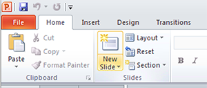
To access other styles of slide click on the arrow next to the "New Slide" button located in the ribbon menu.
