Sport Colour Palette
Our colour palette plays a vital role in delivering a visibly consistent look to all of our communications and has been carefully chosen to reflect our Sport brand look and feel. It is important it is adhered to when creating any marketing materials.
Primary colour palette for Sport
The primary colour palette for the Sport Sub-brand features the University of Stirling primary brand colours; Heritage and Energy Green, Heritage Navy and Purple and Energy Teal.
These colours can be carefully supplemented by other secondary colours, however the dominant colour/s of any marketing collateral should be selected from this primary palette.
- Heritage
-
- #006938
- 0, 105, 56
- 90, 32, 93, 24
- Pantone 349
- Energy
-
- #76bd22
- 118, 189, 34
- 60, 0, 100, 0
- Pantone 368
- Heritage Navy
-
- #14315e
- 20, 49, 94
- 100, 80, 25, 35
- Pantone 540
- Heritage Purple
-
- #31006f
- 49, 0, 111
- 89, 100, 23, 16
- Pantone 2685
- Energy Teal
-
- #008996
- 0, 137, 150
- 100, 312, 41, 4
- Pantone 321
Secondary colour palette
Colours from the secondary palette can be carefully selected to supplement the primary palette.
- Heritage Teal
-
- #005e63
- 0, 94, 99
- 100, 33, 51, 31
- Pantone 323
- Heritage Yellow
-
- #ecaa00
- 236, 170, 0
- 7, 36, 100, 1
- Pantone 124
- Heritage Orange
-
- #e14504
- 225, 69, 4
- 4, 83, 100, 1
- Pantone 1665
- Heritage Blue
-
- #385dae
- 56, 93, 174
- 85, 64, 0, 0
- Pantone 7455
- Heritage Berry
-
- #9d1e65
- 157, 30, 101
- 34, 94, 22, 10
- Pantone 7648
- Heritage Gold
-
- 30, 35, 75, 22
- Pantone 871
- This should only be use for printed materials. Pantone 871 is our preference and should be used if possible.
- Energy Purple
-
- #592c82
- 89, 44, 130
- 81, 96, 4, 1
- Pantone 268
- Energy Yellow
-
- #f4c400
- 244, 196, 0
- 6, 22, 100, 0
- Pantone 7406
- Energy Orange
-
- #ee7624
- 238, 118, 36
- 0, 63, 91, 0
- Pantone 158
- Energy Sky
-
- #5fb4e5
- 95, 180, 229
- 62, 13, 1, 0
- Pantone 2915
- Energy Blue
-
- #3d7dca
- 61, 125, 202
- 77, 46, 0, 0
- Pantone 660
- Energy Pink
-
- #d41568
- 212, 21, 104
- 10, 98, 27, 2
- Pantone 214
Tertiary Colour palette
Our tertiary colours should be used for body text only.
- Tertiary Colour
-
- #c5bfb7
- 197, 191, 183
- 26, 22, 27, 3
- Pantone 400
- Tertiary Colour
-
- #827f77
- 130, 127, 119
- 0, 0, 0, 61
- Pantone 424
- Tertiary Colour
-
- #3a3c39
- 58, 60, 57
- 68, 56, 59, 63
- Pantone 447
Online colour usage
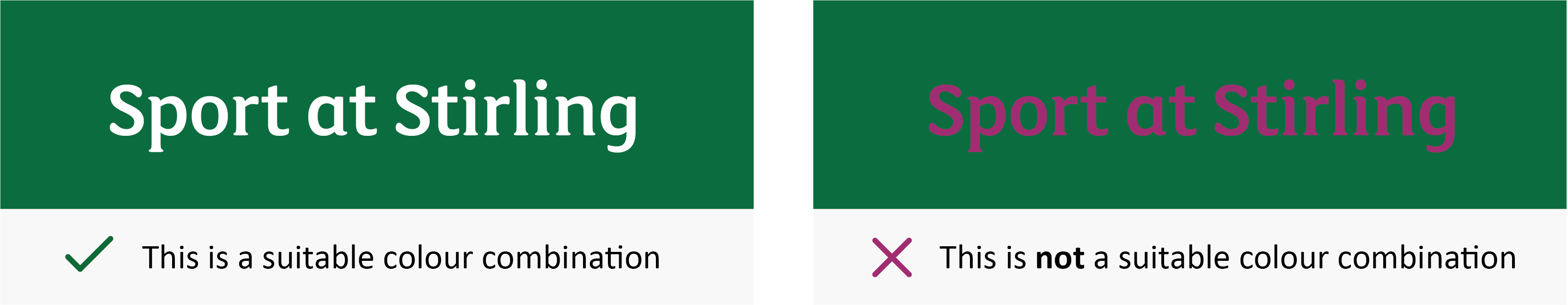
You should always be mindful of issues of legibility when using the palette and avoid using white text on light colours and black text on dark colours.
To adhere to accessibility guidance online, please ensure that sufficient contrast levels exist between colour usage.
Please use this link to access the digital contract check tool: webaim.org/resources/contrastchecker
Colour Accessibility
Although our extensive colour palette provides with you many potential colour combinations, you must ensure that text is clearly legible and accessible so please select colours carefully.
For instance, white text on a Heritage Green background works well – whereas Heritage Berry text on a Heritage Green background is very difficult to read (see examples below).