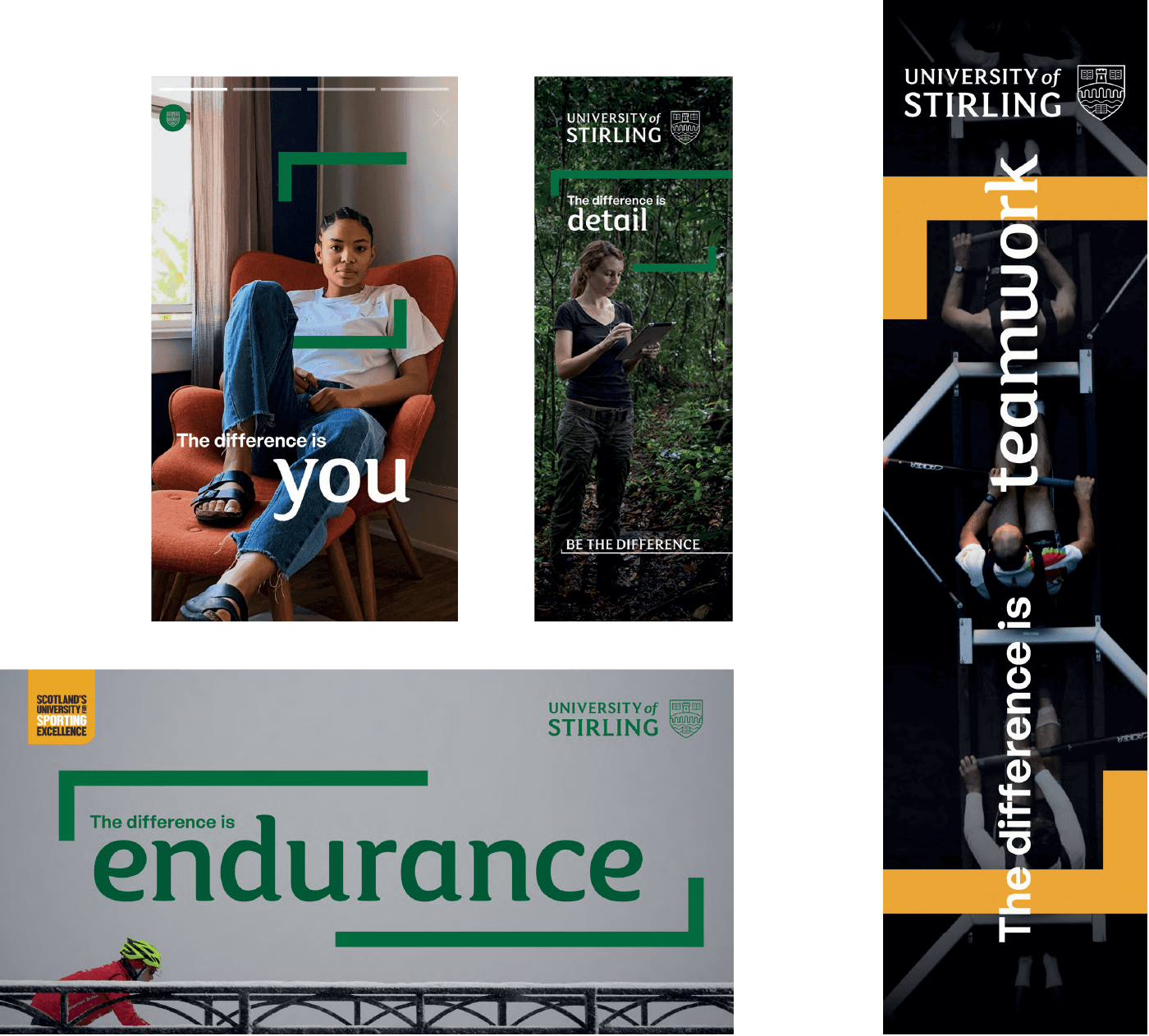
Typography
These are the brand fonts that should be used across all print and digital material.
FS Maja
This is our primary brand font, selected for its rounded shapes that create warmth and personality while still feeling confident and authoritative.
It should be used for headings and sub-headings for communications and marketing materials. It can also be used to hero the keyword or words within graphic titles.
Don't use this for body copy.
A small number of licences are available. Every Directorate and Faculty, and other regular brand users, will be provided with the font by the Marketing Team.
General Sans
Our secondary font, General Sans, should be used for everything else; the non-key words in headings (when combined with FS Maja), secondary sub-headings and body copy.
Combining typefaces
Combining two different typefaces in a scale header draws attention to the key word.
However this should be used sparingly and strategically, as using it in more than one place within one statement can be distracting.
Select a single word or short phrase to hero in FS Maja, and make the rest General Sans.
When it comes to scaling your key word or words, make sure it still feels part of the sentence. It is about emphasising a word rather than making it dominate.

Tracking and leading
Tracking
Tracking is the overall spacing between groups of letters, and kerning is the spacing between individual letter forms. The tracking of all text should be set to 10 units of tracking.
Leading
Leading is the spacing between lines of type. Choosing the appropriate leading or line spacing is very important to the reading quality and efficiency of the typography. The larger the text, the tighter the leading should be.
For leading we adopt a setting of 1.2em. This is a base level guide to allow for subtle revision to accommodate the context of the copy.
![]()
