Logo
The logo is the most visible element of our identity. Logo downloads are available from our Downloads section. If you are an agency or third party and have any question, please contact the Marketing Team marketingtools@stir.ac.uk.
Always use the master artwork for reproduction.
Primary logo
Our primary logo is the full colour primary logo in Pantone 349 - and should be used at all times.
Alternatives
Alternative colour variants have been created based on our primary logo - these should only be used when you can't use the full colour primary logo above.
The black background shown here is not a coloured box – the visual shows what the white logo alternative would look like against a coloured background. The logo should never sit inside a box - please refer to the Incorrect Usage section on this page.
Black logo
White logo
Logo exclusion zone
Our logo needs to stand out. If there are lots of other elements crowding around it, it loses impact.
The exclusion zone refers to the minimum amount of space we should have around the logo. It’s worth remembering that this is just a minimum – it’s better to give the logo more space than this.
We measure the exclusion zone by taking the height of the crest and using it to mark out the surrounding area. No other elements should encroach on this clear space.
Logo positioning
Primary position
The primary position for the logo is either top or bottom right.
Secondary position
In some cases the top or bottom right may not be suitable eg. web applications. In this case the logo can be placed in the left hand corner.
Logo and Strapline lock-up
The scale and position of our strapline is generally in direct relationship to the logo. Adopting the same alignment and positioned to the bottom right corner of the canvas.
Clear space guidance to the logo applies to minimum distance.
Logo subtitling
All Faculties and services use a subtitled logo which incorporates the Faculty/service name with the University logo.
All logo style text must be in the approved University fonts.
The only exceptions to logo and typographic style apply in the following cases:
- Sport
- Stirling Business School
- Institute of Aquaculture
- International Study Centre
- Stirling Venues
Crest and wordmarque elements
Our logo is made up of two basic elements. The 'wordmarque' relates to the words 'University of Stirling'. The wordmarque and the crest should never be separated, except for use as a social media avatar. Please refer to our social media guidelines for more information.
Minimum size
It’s also important to keep our logo legible, so we have provided a minimum size for reproduction.
Incorrect usage
- Do not use colours other than the brand colours
- Do not distort the logo
- Do not stack the logo
- Do not change the typeface in the logo
- Do not rotate the logo
- Do not change the arrangement of the elements
- Do not change the size of any of the logo elements
- Do not place the logo on busy backgrounds
- Do not place the logo in a box
- Do not place the logo with low contrasting colours
- Do not use the wordmarque without the crest
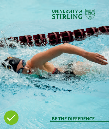
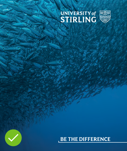
Do
Use images with enough clear space to house the brand identifiers i.e. logo and strapline so that they stand out and are legible.


Don't
Use colour options that clash or fade into your image.


