Colour Palette
Our colour palette plays a vital role in delivering a visibly consistent look to all of our communications. Green is our primary colour as it reflects the natural beauty of our green campus.
Specific Pantone® numbers are provided for colour matching and spot colour ink for print applications. Process colour (CMYK) values are provided for 4-colour print needs. RGB and Hex colour values have also been provided for digital applications.
By adhering to these guidelines, we maintain a cohesive and impactful colour palette that effectively represents the University's brand in various contexts. This page shows approved colour pairings that can be applied, tested to pass WCAG 2.1 Level AA accessibility standards.
- 02 Green
-
- #006938
- 0, 105, 56
- 90, 32, 93, 24
- Pantone 349
- WCAG 2.1 Level AA
- 70% - Large Text
- White - Large/Normal Text
- 01 Green
-
- #77BF22
- 119, 191, 34
- 60, 0, 100, 0
- Pantone 368
- WCAG 2.1 Level AA
- 03 - Large Text
- Black - Large/Normal Text
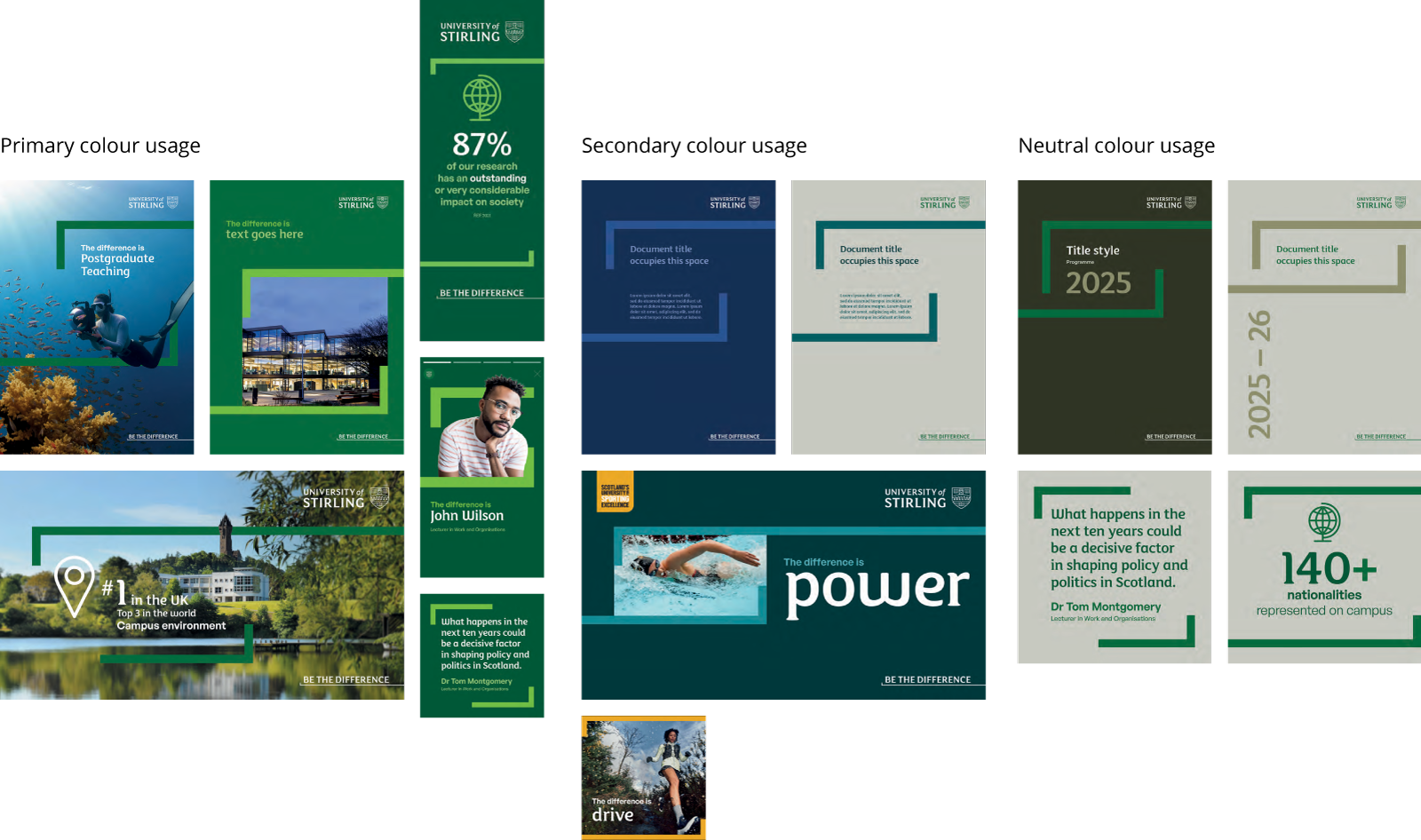
Primary colours
Our primary colour palette has been carefully chosen to identify and differentiate us.
Green is our primary colour - Heritage Green (02 Green) and Energy Green (01 Green) - and serves as the cornerstone of our brand identity.
In practical terms, this means that Green should clearly be the dominant colour across all brand communications. This allows us to establish a strong and recognisable visual presence.
- 03 Green
-
- #005734
- 0, 87, 52
- 93, 38, 88, 38
- Pantone 7484
- WCAG 2.1 Level AA
- 01 - Large Text
- 70% - Large/Normal Text
- White - Large/Normal Text
- 70% tint 01 Green
-
- #9fcd6a
- 0, 105, 56
- 90, 32, 93, 24
- Pantone 349
- WCAG 2.1 Level AA
- 03 - Large Text
- Black - Large/Normal Text
Alongside our Heritage Green (02 Green) and Energy Green (01 Green), we have introduced two new Green shades and tints – (03 Green and 70% tint 01 Green) these should be used as accents, in order to add dynamism to our Green Primary Colour Palette.
Secondary colours
Our secondary colour palette brings our colourful world at the University to life.
These colours have been carefully selected to make sure they work with our Primary Greens. They’re displayed in a dark (left) to light (right) tonality scale and should be used as individual colour sets and not be mixed.
Don't mix colours! We exercise a limited palette to keep things controlled and allow our primary greens to cut through.
Use tones from the same colour set, to create a tone-on-tone effect, keeping the look of your work vibrant but clean and professional.
In the key here, you can see which colours to make your type for every colour combination in the palette - for both headlines and titles and body copy (Large/Normal text).
- 03 Teal
-
- #003A3D
- 0, 58, 61
- 93, 51, 56, 59
- Pantone 309
- WCAG 2.1 Level AA
- 01 - Large Text
- 70% - Large Text
- White - Large/Normal Text
- 02 Teal
-
- #005e63
- 1, 94, 99
- 88, 38, 49, 33
- Pantone 7708
- WCAG 2.1 Level AA
- White - Large/Normal Text
- 01 Teal
-
- #008996
- 0, 137, 150
- 82, 25, 37, 8
- Pantone 321
- WCAG 2.1 Level AA
- White - Large Text
- Black - Large/Normal Text
- 70% tint 01 Teal
-
- #4cacb5
- 0, 137, 150
- 82, 25, 37, 8
- Pantone 321
- WCAG 2.1 Level AA
- 03 - Large Text
- Black - Large/Normal Text
- 03 Blue
-
- #122c54
- 18, 44, 84
- 100, 85, 39, 34
- Pantone 540
- WCAG 2.1 Level AA
- 01 - Large Text
- 70% - Large Text
- White - Large/Normal Text
- 02 Blue
-
- #2c498a
- 44, 73, 138
- 93, 74, 16, 3
- Pantone 7684
- WCAG 2.1 Level AA
- 70% - Large Text
- White - Large/Normal Text
- 01 Blue
-
- #3d7dca
- 61, 125, 202
- 77, 46, 0, 0
- Pantone 660
- WCAG 2.1 Level AA
- White - Large Text
- Black - Large/Normal Text
- 70% tint 01 Blue
-
- #77a4da
- 61, 125, 202
- 77, 46, 0, 0
- Pantone 660
- WCAG 2.1 Level AA
- 03 - Large Text
- Black - Large/Normal Text
- 03 Purple
-
- #3F0066
- 63, 0, 102
- 92, 100, 26, 20
- Pantone 2617C
- WCAG 2.1 Level AA
- 01 - Large Text
- 70% - Large Text
- White - Large/Normal Text
- 02 Purple
-
- #592c82
- 89, 44, 130
- 81, 96, 4, 0
- Pantone 268
- WCAG 2.1 Level AA
- White - Large/Normal Text
- 01 Purple
-
- #9053C6
- 44, 83, 198
- 56, 76, 0, 0
- Pantone 7442C
- WCAG 2.1 Level AA
- Black - Large Text
- White - Large/Normal Text
- 70% tint 01 Purple
-
- #b186d7
- 44, 83, 198
- 56, 76, 0, 0
- Pantone 7442C
- WCAG 2.1 Level AA
- 03 - Large Text
- Black - Large/Normal Text
- 03 Pink
-
- #511535
- 81, 21, 53
- 53, 96, 38, 58
- Pantone 5125
- WCAG 2.1 Level AA
- 01 - Large Text
- 70% - Large Text
- White - Large/Normal Text
- 02 Pink
-
- #7c184f
- 124, 24, 79
- 43, 99, 30, 32
- Pantone 216
- WCAG 2.1 Level AA
- 70% - Large Text
- White - Large/Normal Text
- 01 Pink
-
- #e80068
- 232, 0, 104
- 0, 100, 31, 0
- Pantone Rubine Red
- WCAG 2.1 Level AA
- White - Large/Normal Text
- Black - Large/Normal Text
- 70% tint 01 Pink
-
- #ef4c95
- 232, 0, 104
- 0, 100, 31, 0
- Pantone Rubine Red
- WCAG 2.1 Level AA
- 03 - Large Text
- Black - Large/Normal Text
- 03 Orange
-
- #852903
- 133, 41, 3
- 30, 90, 100, 36
- Pantone 7526
- WCAG 2.1 Level AA
- 01 - Large Text
- 70% - Large Text
- White - Large/Normal Text
- 02 Orange
-
- #d9541a
- 217, 84, 26
- 10, 76, 98, 1
- Pantone 1595
- WCAG 2.1 Level AA
- White - Large/Normal Text
- 01 Orange
-
- #FF6D00
- 255, 109, 0
- 0, 67, 94, 0
- Pantone 1505
- WCAG 2.1 Level AA
- White - Large/Normal Text
- Black - Large/Normal Text
- 70% tint 01 Orange
-
- #ff994c
- 255, 109, 0
- 0, 67, 94, 0
- Pantone 1505
- WCAG 2.1 Level AA
- 03 - Large Text
- Black - Large/Normal Text
- 03 Yellow
-
- #7b5c18
- 123, 92, 4
- 37, 51, 98, 40
- Pantone 7552
- WCAG 2.1 Level AA
- 02 - Large Text
- 01 - Large Text
- 70% - Large Text
- White - Large/Normal Text
- 02 Yellow
-
- #edab00
- 237, 171, 0
- 6, 36, 97, 0
- Pantone 130
- WCAG 2.1 Level AA
- 03 - Large Text
- Black - Large/Normal Text
- 01 Yellow
-
- #f4c400
- 244, 196, 0
- 6, 22, 96, 0
- Pantone 7406
- WCAG 2.1 Level AA
- 03 - Large Text
- Black - Large/Normal Text
- 70% tint 01 Yellow
-
- #f7d64c
- 244, 196, 0
- 6, 22, 96, 0
- Pantone 7406
- WCAG 2.1 Level AA
- 03 - Large Text
- Black - Large/Normal Text
Neutral colours
A suite of carefully curated neutrals support our library of secondary colours.
You can use these colours as backgrounds or accents throughout collateral to offer warmth where necessary. These are great to offer a premium appeal to collateral, but remember our Primary Greens should be present in all that we do.
Don't create any documents using only the neutral palette.
- 04 Neutral
-
- #3a3a26
- 58, 58, 38
- 66, 54, 77, 64
- Pantone 5747
- WCAG 2.1 Level AA
- 01 Green - Large/Normal Text
- 70% 01 - Large/Normal Text
- White - Large/Normal Text
- 03 Neutral
-
- #5f6350
- 95, 99, 80
- 58, 43, 62, 36
- Pantone 417
- WCAG 2.1 Level AA
- 70% 01 - Large Text
- White - Large/Normal Text
- 02 Neutral
-
- #97956d
- 151, 149, 109
- 42, 30, 60, 3
- Pantone 451C
- WCAG 2.1 Level AA
- White - Large Text
- Black - Large/Normal Text
- 01 Neutral
-
- #d1d1c9
- 209, 209, 201
- 21, 15, 21, 1
- Pantone Warm Gray 1 C
- WCAG 2.1 Level AA
- 03 - Green - Large/Normal Text
- 02 - Green - Large/Normal Text
- Black - Large/Normal Text
Tertiary colours
Our tertiary colours should be used for body text and some messaging.
Grey is an alternative option to black for body copy, especially where the volume of text is large, and softening the copy colour will aid readability.
Use the text colour options provided only.
Don't create any documents using only black and white.
- Black
-
- #000000
- 0, 0, 0
- 0, 0, 0, 100
- Pantone Black
- WCAG 2.1 Level AA
- 02 - Large Text
- 01 - Green - Large/Normal Text
- 70% 01 - Large/Normal Text
- White - Large/Normal Text
- Grey
-
- #3a3c39
- 58, 60, 57
- 68, 56, 59, 63
- Pantone 447
- WCAG 2.1 Level AA
- 01 - Green - Large/Normal Text
- 70% 01 - Large/Normal Text
- White - Large/Normal Text
- White
-
- #ffffff
- 255, 255, 255
- 0, 0, 0, 0
- Pantone White
- WCAG 2.1 Level AA
- 03 - Green - Large/Normal Text
- 02 - Green - Large/Normal Text
- Black - Large/Normal Text
Online colour usage
You should always be mindful of issues of legibility when using the palette and avoid using white text on light colours and black text on dark colours.
To adhere to accessibility guidance online, please ensure that sufficient contrast levels exist between colour usage.
Please use this link to access the digital contract check tool: webaim.org/resources/contrastchecker